.png)
Introduce different products of yours and link to each one in the CTA below
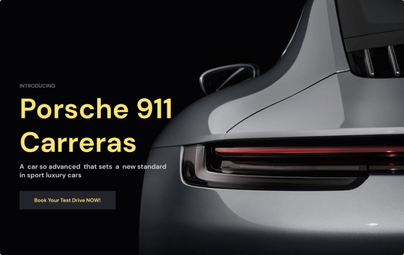
The cards module is a super module with multiple variations. You can change the structures of the cards with the variation option, you can put an image on their background with overlay filtering, and you can add a CTA or link. You can also set how many cards will be in a row according to the variation option. It is an important module to highlight your product with a Title, Description, and Fade-in animation.
Introduce different products of yours and link to each one in the CTA below
Share success stories and let the visitor know how you have already helped other customers
.png)
Announce a helpful e-book or guide that your visitors can download
.png)
Introduce an article of yours that you can link to in the CTA below.

Lorem ipsum dolor sit amet, consectetur adipisicing elit. Ad eum dolorum architecto obcaecati enim dicta praesentium, quam nobis! Neque ad aliquam facilis...

Lorem ipsum dolor sit amet, consectetur adipisicing elit. Ad eum dolorum architecto obcaecati enim dicta praesentium, quam nobis! Neque ad aliquam facilis...
Lorem ipsum dolor sit amet, consectetur adipisicing elit. Ad eum dolorum architecto obcaecati enim dicta praesentium, quam nobis! Neque ad aliquam facilis...
Lorem ipsum dolor sit amet, consectetur adipisicing elit. Ad eum dolorum architecto obcaecati enim dicta praesentium, quam nobis! Neque ad aliquam facilis...
Lorem ipsum dolor sit amet, consectetur adipisicing elit. Ad eum dolorum architecto obcaecati enim dicta praesentium, quam nobis! Neque ad aliquam facilis...
Lorem ipsum dolor sit amet, consectetur adipisicing elit. Ad eum dolorum architecto obcaecati enim dicta praesentium, quam nobis! Neque ad aliquam facilis...
Lorem ipsum dolor sit amet, consectetur adipisicing elit. Ad eum dolorum architecto obcaecati enim dicta praesentium, quam nobis! Neque ad aliquam facilis...

Lorem ipsum dolor sit amet, consectetur adipisicing elit. Ad eum dolorum architecto obcaecati enim dicta praesentium, quam nobis! Neque ad aliquam facilis...
Lorem ipsum dolor sit amet, consectetur adipisicing elit. Ad eum dolorum architecto obcaecati enim dicta praesentium, quam nobis! Neque ad aliquam facilis...
Lorem ipsum dolor sit amet, consectetur adipisicing elit. Ad eum dolorum architecto obcaecati enim dicta praesentium, quam nobis! Neque ad aliquam facilis...
Lorem ipsum dolor sit amet, consectetur adipisicing elit. Ad eum dolorum architecto obcaecati enim dicta praesentium, quam nobis! Neque ad aliquam facilis...
Lorem ipsum dolor sit amet, consectetur adipisicing elit. Ad eum dolorum architecto obcaecati enim dicta praesentium, quam nobis! Neque ad aliquam facilis...
Lorem ipsum dolor sit amet, consectetur adipisicing elit. Ad eum dolorum architecto obcaecati enim dicta praesentium, quam nobis! Neque ad aliquam facilis...
Lorem ipsum dolor sit amet, consectetur adipisicing elit. Ad eum dolorum architecto obcaecati enim dicta praesentium, quam nobis! Neque ad aliquam facilis...
Lorem ipsum dolor sit amet, consectetur adipisicing elit. Ad eum dolorum architecto obcaecati enim dicta praesentium, quam nobis! Neque ad aliquam facilis...
Lorem ipsum dolor sit amet, consectetur adipisicing elit. Ad eum dolorum architecto obcaecati enim dicta praesentium, quam nobis! Neque ad aliquam facilis...
Lorem ipsum dolor sit amet, consectetur adipisicing elit. Ad eum dolorum architecto obcaecati enim dicta praesentium, quam nobis! Neque ad aliquam facilis...
Lorem ipsum dolor sit amet, consectetur adipisicing elit. Ad eum dolorum architecto obcaecati enim dicta praesentium, quam nobis! Neque ad aliquam facilis...
Lorem ipsum dolor sit amet, consectetur adipisicing elit. Ad eum dolorum architecto obcaecati enim dicta praesentium, quam nobis! Neque ad aliquam facilis...
Lorem ipsum dolor sit amet, consectetur adipisicing elit. Ad eum dolorum architecto obcaecati enim dicta praesentium, quam nobis! Neque ad aliquam facilis...
Lorem ipsum dolor sit amet, consectetur adipisicing elit. Ad eum dolorum architecto obcaecati enim dicta praesentium, quam nobis! Neque ad aliquam facilis...
Lorem ipsum dolor sit amet, consectetur adipisicing elit. Ad eum dolorum architecto obcaecati enim dicta praesentium, quam nobis! Neque ad aliquam facilis...
Lorem ipsum dolor sit amet, consectetur adipisicing elit. Ad eum dolorum architecto obcaecati enim dicta praesentium, quam nobis! Neque ad aliquam facilis...
Lorem ipsum dolor sit amet, consectetur adipisicing elit. Ad eum dolorum architecto obcaecati enim dicta praesentium, quam nobis! Neque ad aliquam facilis...
Lorem ipsum dolor sit amet, consectetur adipisicing elit. Ad eum dolorum architecto obcaecati enim dicta praesentium, quam nobis! Neque ad aliquam facilis...
Lorem ipsum dolor sit amet, consectetur adipisicing elit. Ad eum dolorum architecto obcaecati enim dicta praesentium, quam nobis! Neque ad aliquam facilis...
Lorem ipsum dolor sit amet, consectetur adipisicing elit. Ad eum dolorum architecto obcaecati enim dicta praesentium, quam nobis! Neque ad aliquam facilis...
Lorem ipsum dolor sit amet, consectetur adipisicing elit. Ad eum dolorum architecto obcaecati enim dicta praesentium, quam nobis! Neque ad aliquam facilis...
Lorem ipsum dolor sit amet, consectetur adipisicing elit. Ad eum dolorum architecto obcaecati enim dicta praesentium, quam nobis! Neque ad aliquam facilis...
Lorem ipsum dolor sit amet, consectetur adipisicing elit. Ad eum dolorum architecto obcaecati enim dicta praesentium, quam nobis! Neque ad aliquam facilis...
Lorem ipsum dolor sit amet, consectetur adipisicing elit. Ad eum dolorum architecto obcaecati enim dicta praesentium, quam nobis! Neque ad aliquam facilis...
Lorem ipsum dolor sit amet, consectetur adipisicing elit. Ad eum dolorum architecto obcaecati enim dicta praesentium, quam nobis! Neque ad aliquam facilis...
Lorem ipsum dolor sit amet, consectetur adipisicing elit. Ad eum dolorum architecto obcaecati enim dicta praesentium, quam nobis! Neque ad aliquam facilis...

Lorem ipsum dolor sit amet, consectetur adipisicing elit. Ad eum dolorum architecto obcaecati enim dicta praesentium, quam nobis! Neque ad aliquam facilis...

Lorem ipsum dolor sit amet, consectetur adipisicing elit. Ad eum dolorum architecto obcaecati enim dicta praesentium, quam nobis! Neque ad aliquam facilis...

Lorem ipsum dolor sit amet, consectetur adipisicing elit. Ad eum dolorum architecto obcaecati enim dicta praesentium, quam nobis! Neque ad aliquam facilis...
Lorem ipsum dolor sit amet, consectetur adipisicing elit. Ad eum dolorum architecto obcaecati enim dicta praesentium, quam nobis! Neque ad aliquam facilis...
Lorem ipsum dolor sit amet, consectetur adipisicing elit. Ad eum dolorum architecto obcaecati enim dicta praesentium, quam nobis! Neque ad aliquam facilis...
Lorem ipsum dolor sit amet, consectetur adipisicing elit. Ad eum dolorum architecto obcaecati enim dicta praesentium, quam nobis! Neque ad aliquam facilis...
Lorem ipsum dolor sit amet, consectetur adipisicing elit. Ad eum dolorum architecto obcaecati enim dicta praesentium, quam nobis! Neque ad aliquam facilis...
Packed with a wealth of popular modern interface patterns!
Packed with a wealth of popular modern interface patterns!
Packed with a wealth of popular modern interface patterns!
Packed with a wealth of popular modern interface patterns!
Packed with a wealth of popular modern interface patterns!
Packed with a wealth of popular modern interface patterns!
Packed with a wealth of popular modern interface patterns!
Packed with a wealth of popular modern interface patterns!
1. Choose components Packed with a wealth of popular modern interface patterns!
1. Choose components Packed with a wealth of popular modern interface patterns!
1. Choose components Packed with a wealth of popular modern interface patterns!
1. Choose components Packed with a wealth of popular modern interface patterns!
1. Choose components Packed with a wealth of popular modern interface patterns!
1. Choose components Packed with a wealth of popular modern interface patterns!
1. Choose components Packed with a wealth of popular modern interface patterns!
1. Choose components Packed with a wealth of popular modern interface patterns!
To design is much more than simply to assemble, to order, or even to edit: it is to add
value and meaning, to illuminate, to simplify, to clarify, to modify, to dignify, to dramatize,
to persuade, and perhaps even to amuse.
